
Read any market cap to GDP figure in three steps. First, identify the series: which equities sit in the numerator, and whether the denominator is GDP or GNP. Second, split the ratio into a price-to-profit multiple and a profit share of output, since either can move it. Third, compare a reading only with the same series' own history. A shift in its baseline is information about the economy before it is a verdict on price.
What the Buffett indicator measures, and where it came from
The ratio takes its name from a December 2001 essay in Fortune, written by Warren Buffett with Carol Loomis. In Buffett's 2001 essay on the stock market, he charted the market value of all publicly traded US securities from 1924 onward. He expressed it as a percentage of gross national product. He granted that the ratio has limitations. He also called it "probably the best single measure of where valuations stand at any given moment" in the same passage.
His chart showed the ratio approaching 200 percent in 1999 and part of 2000, and at 133 percent shortly before publication. He attached reference zones to it, from the 70 to 80 percent area up to readings near 200 percent. Those zones were drawn on one series, over one stretch of history, with one denominator. Most of what follows explains why they do not transfer mechanically to a series built another way.
The structure of the ratio is unusual for a valuation measure. The numerator is a stock: the capitalized value of every future dollar the companies are expected to distribute. The denominator is a flow: one year of value added across the whole economy. In that sense it resembles an economy-wide price-to-sales ratio, with value added standing in for sales. Like any price-to-sales figure, it says nothing about margins until margins are measured separately.
Buffett argued that two variables explained the market's long swings: interest rates and the profitability of corporations. He described rates as acting like gravity on every financial asset. He noted that after-tax corporate profits had normally run between 4 and 6.5 percent of GDP over the previous 50 years. Both variables move the ratio, and neither is visible in the headline number.
The indicator also measures something the CAPE ratio does not. The pillar article on what CAPE measures covers a price-to-earnings ratio in which the same companies sit in both halves. The Buffett indicator divides one set of entities, listed or incorporated businesses, by the output of an entire economy. That mismatch is the source of most of its failure modes, and the sections below take them one at a time.
Which numerator and denominator a published series uses
There is no single official Buffett indicator. Published versions differ in both halves, so two charts labeled with the same name can show different levels.
The numerator. Three constructions are common.
- A broad total-market index of US-listed companies, measured at full market value.
- The Federal Reserve's Financial Accounts, which report the market value of corporate equities by issuing sector.
- The World Bank series of listed domestic companies, used mainly for cross-country work.
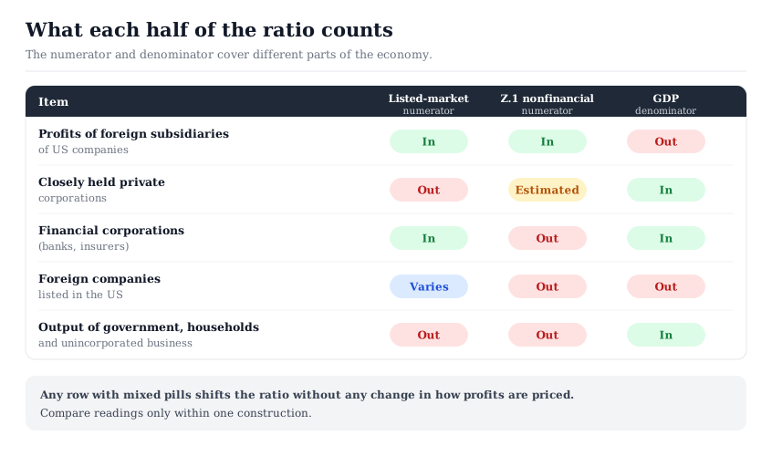
The Financial Accounts version carries the most surprises. The nonfinancial corporate equities series on FRED, drawn from the Fed's Z.1 release, covers nonfinancial corporations only. Banks, insurers and other financial companies sit elsewhere in the accounts. The same series includes closely held companies, whose equity is never traded and has to be estimated.
A Federal Reserve note on corporate equities by issuer documents the method. Closely held S corporations are valued from IRS-reported book net worth, scaled by market-to-book ratios of public peers. Large closely held C corporations are valued from revenue data compiled by Forbes, using a matched public sample. A 25 percent discount is then applied for illiquidity. The note's decomposition is as of the fourth quarter of 2015. It put publicly traded domestic firms at 68.9 percent of total corporate equity and closely held firms at 12.3 percent. Foreign companies' shares sold in US markets made up the remaining 18.9 percent.
The denominator. Buffett used gross national product. Most modern versions use gross domestic product. GDP measures output produced inside the country. GNP adds income US residents earn abroad and subtracts income paid to foreign residents. For the US the two differ by a small net amount, because income paid abroad largely offsets income received. The larger gap is the gross foreign profit capitalized in the numerator.
The mismatch. Line the two halves up and several items appear on one side only. Profits of foreign subsidiaries raise equity value but sit outside GDP. Output of government, households and unincorporated businesses sits in GDP but in no equity numerator. Financial companies are in a listed-market numerator but not in the Z.1 nonfinancial series. Before comparing any two readings, confirm they come from the same construction.
The decomposition: an aggregate multiple times a profit share
The most useful thing to do with the ratio is to split it. Insert corporate profits into both halves and the ratio factors into two parts that multiply back to the original.
Market value ÷ GDP = (market value ÷ corporate profits) × (corporate profits ÷ GDP)
where the first factor is the aggregate multiple and the second is the profit share. Both are measured on the same national-accounts profit series, so the product always equals the original ratio.
The first factor is an economy-wide price-to-earnings ratio, measured on national-accounts profits rather than reported earnings. The second is corporate profits relative to GDP, called the profit share here. National-accounts profits include receipts from abroad, so it is not strictly a share of domestic output. The identity holds by construction, so every movement in the indicator can be allocated between the two.
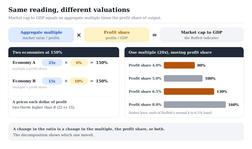
A worked pair shows why this matters. Take two illustrative economies that both read 150 percent. In the first, equity trades at 25 times profits and profits are 6 percent of GDP. In the second, equity trades at 15 times profits and profits are 10 percent of GDP. The headline readings match. But the first economy prices each dollar of profit two-thirds higher than the second, because 25 is 1.67 times 15.
Run it the other way and the profit share alone can move the ratio. Hold the multiple fixed at 20. A profit share of 5 percent gives 100 percent. A profit share of 8 percent gives 160 percent. Nothing about how investors price a dollar of profit changed between the two readings. Buffett's normal band for after-tax profits of 4 to 6.5 percent of GDP, at an after-tax multiple of 20, spans readings of 80 to 130 percent.
That is the central reading rule. A rising Buffett indicator is a statement that either the multiple or the profit share rose, or both. The multiple is the part that describes valuation in the usual sense, provided the numerator and the profit measure cover the same companies. Where they do not, coverage gaps land in the multiple. The profit share describes how the economy's output is being split between corporations and everyone else.
The same logic separates the indicator from the CAPE pair. A cyclically adjusted P/E is closer to the first factor, computed on smoothed index earnings per share. The method, including the choice of earnings series, is set out in how to calculate a cyclically adjusted P/E. When the profit share rises and stays high, CAPE's ten-year denominator absorbs it slowly. The Buffett indicator registers it at once. When the two measures disagree, the profit share is one common reason.
Why the ratio's baseline drifts over time
A stable long-run average invites comparison. The Buffett indicator's parts do not hold still, so its average moves. Four sources of drift are worth separating.
Foreign profits. US corporations earn a large and variable share of their profits abroad. BEA data on corporate profits received from the rest of the world put those receipts at $1,064 billion in 2025. The same year's total corporate profits, with inventory valuation and capital consumption adjustments, were $4,025 billion. That is a foreign-receipts share of 26.4 percent. Across 1998 to 2025, the annual share ranged from 17.6 percent in 1998 to 42.6 percent in 2008. Figures are as published on FRED, series last updated September 30, 2026, read October 2, 2026. Equity value capitalizes all of those profits, while GDP counts none of them. The share moved both ways, so this drift has no fixed direction.
Listing and ownership mix. A listed-market numerator depends on how much business activity is organized as listed companies. When companies stay private longer, or when listed companies are taken private, the numerator shrinks relative to output. The Fed note above found that the closely held share of corporate equity rose from 1996 onward, though more modestly than the foreign share. A listed-only series and the Z.1 series will drift apart when that mix changes.
Sector mix and capital intensity. An economy whose output shifts toward high-margin, asset-light businesses raises the profit share without any repricing. The multiple on those profits can also sit higher, because less of each dollar must be reinvested. Market concentration in index valuation shows the same arithmetic inside one index: a change in mix moves an aggregate ratio with no member repricing.
Interest rates. The multiple factor absorbs every change in the discount rate. Holding growth and risk premiums constant, the same profits are worth more when rates are lower. The transmission is set out in how interest rates flow into stock valuation. A long stretch of falling rates can lift the indicator's average for a generation. The aggregate yield comparison in earnings yield versus bond yield makes the rate term explicit rather than leaving it buried.
None of these drifts makes the ratio wrong. Each changes what a given level means. The practical consequence is that a long-run average of the indicator is an average across different economies. Comparing a reading with that average assumes the profit share, foreign share, listing mix and rate level all sit where they sat on average. That assumption needs checking before the comparison says anything about price.
What the ratio implies about aggregate growth
The ratio also carries a growth identity that is harder to argue with than any threshold. Market value equals the ratio times GDP. So over any period, the growth of total market value equals GDP growth compounded with the change in the ratio.
Market value growth factor = GDP growth factor × (ending ratio ÷ starting ratio)
where each growth factor is the ending level divided by the starting level over the same period, and GDP is measured in nominal terms like market value.
Buffett made the point directly in the 2001 essay. If output grows 5 percent a year and market value is to grow 10 percent, the ratio must rise without limit. The arithmetic is easy to check. The ratio would have to grow by a factor of 1.10 divided by 1.05, or 4.76 percent a year. Over ten years that compounds to a factor of 1.59, which would take his 133 percent reading to about 212 percent.
A second worked set shows the range a starting level leaves open. Assume nominal GDP grows 4 percent a year for ten years, a cumulative factor of 1.480. These figures are illustrative.
- Ratio unchanged at 150 percent. Market value grows by the same factor, 4.00 percent a year.
- Ratio falls from 150 to 120 percent. The factor is 1.480 times 0.8, or 1.184. That is 1.71 percent a year.
- Ratio rises from 150 to 180 percent. The factor is 1.480 times 1.2, or 1.776. That is 5.91 percent a year.
The spread between the second and third cases is more than 4 percentage points a year, from a 20 percent change in the ratio in either direction. Nothing in the identity says which case occurs. It only shows how much of any growth figure rests on an assumption about the ratio itself.
One boundary matters here. Growth in total market value is not the return to shareholders. Dividends are paid out of the aggregate and do not appear in its growth. Buybacks shrink the aggregate while paying holders. New issuance, including listings of new companies, adds market value that no existing holder earned. Aggregate shareholder return is market value growth plus dividends, buybacks and cash paid in acquisitions, less the market value added by new issuance and listings. A projection built only on market value growth leaves out every one of those terms.
How the Buffett indicator compares with CAPE and cross-country readings
The two market-level ratios most often quoted side by side fail for different reasons.
CAPE divides index price by ten years of inflation-adjusted index earnings. Both halves describe the same companies. Its failure modes sit in the denominator: the smoothing window, changes in accounting that alter what earnings mean, and composition shifts across decades. The pillar piece on what CAPE measures treats those limits. A CAPE reading is a statement about the multiple on one set of earnings.
The Buffett indicator divides the value of one set of companies by the output of a whole economy. Its failure modes sit in the gap between the halves: foreign profits, private companies, the profit share and the sector mix. A reading is a statement about the multiple and the profit share together.
When both ratios sit at the top of their own histories, a high multiple is the simplest explanation. When the Buffett indicator is high and CAPE is not, a high profit share is one likely source. When CAPE is high and the Buffett indicator is not, look for a low profit share or a shrinking listed sector. Reading the pair together is a rough first check on how much of a high reading is price and how much is profit share.
Cross-country readings add a further layer. The World Bank's market capitalization of listed domestic companies indicator uses exchange data from the World Federation of Exchanges. It excludes investment funds and pure holding companies, and it counts foreign companies listed only on that exchange. Its own notes caution that market size can be measured several ways, each ranking countries differently.
Two structural facts dominate the comparison. Countries differ in how much business is financed through listed equity rather than banks and private owners. Global companies are listed in one country but earn across many. A small economy hosting a few multinationals can carry a listed market value several times its GDP for reasons unrelated to valuation. The region-by-region comparison in how to compare global stock market valuations uses multiples on the same earnings basis for that reason.
Where market cap to GDP fits in a company-level workflow
The Buffett indicator belongs in the step where a reader sets expectations for the aggregate, not the step where a company is valued. No single business's cash flows, balance sheet or risk appear anywhere in the ratio. Treating a market-level reading as an input to a company valuation mixes two different questions.
It still has a use at the company level: it tests assumptions. Suppose a company valuation holds a margin well above its sector's history, or a terminal multiple far above the market's. It is making the same kind of assumption the aggregate ratio exposes. The decomposition above is a reminder to ask which part of a high number is price and which part is profitability. That question applies to a single company as much as to an economy.
The InvestViable Valuator runs a discounted cash flow from inputs the analyst sets: the cash flow growth path, the discount rate, and the terminal growth rate. No market-level ratio enters it. The InvestViable stock screener filters a universe of 3,000+ US stocks on fundamentals. The large-cap slice of the Stock Universe lists the large-cap companies in that universe. The financials sector slice lists listed financial companies, the group a nonfinancial equity series excludes.
One omission here is deliberate: this article quotes no current reading of the ratio. A reading dates within a quarter, and the dated market view sits in the US stock market valuation analysis. The arithmetic above holds at any level. Before quoting a Buffett indicator, name the series, state both factors, and compare it only with its own history.
InvestViable does not publish buy or sell recommendations on individual securities. All analysis is based on public financial data and a transparent methodology. The Investment Score formula is proprietary; the inputs and what the score evaluates are documented.