Why dashboard design determines investment behavior
Most investors assume their decisions come from analysis. Research suggests otherwise. Tech-enabled data access increases overconfidence and trading frequency by 8.6 to 10.5% within one month. The problem does not lie with the tools themselves. It lies with the absence of a structured review process matched to the investment strategy.
Generic financial platforms cater to active traders. Their default layouts display minute-by-minute charts and volume indicators encourage immediate action. Fundamental investors who use these same layouts without modification expose themselves to the same behavioral pressures as day traders.
Research confirms that attention frequency triggers ostrich effects, where investors check their portfolios less during periods of low returns and high volatility, exactly when disciplined analysis matters most. The solution is not a better data feed. It is a deliberately structured checklist that dictates what to look at, when to look at it, and why.
Disclaimer: This article provides educational information only and does not constitute investment advice. The discussed dashboards organize information, but they do not predict outcomes.
Five-layer checklist
A checklist-driven dashboard separates metrics into five distinct layers. Well-configured stock market dashboards group these layers deliberately rather than displaying every available metric at once. Each layer answers a specific question about the investment.
This separation prevents the common failure mode where investors review every metric daily and mistake noise for signal. Each layer operates on a different review schedule, weekly, monthly, or quarterly, matched to the natural cadence of the underlying data.
The five layers are as follows:
-
Valuation — Are current prices justified by historical averages?
-
Earnings Quality — Does reported profit reflect real cash generation?
-
Macroeconomic Context — What is the broader market environment signaling?
-
Competitive Moat — Is the business durability strengthening or eroding?
-
Risk and Red Flags — Are there early warning signs of fundamental deterioration?
Grouping metrics into these categories transforms a chaotic screen into a practical audit tool. Investors evaluate companies consistently across all market environments when they follow this structure rather than reacting to whatever number appears most prominently on their screen.
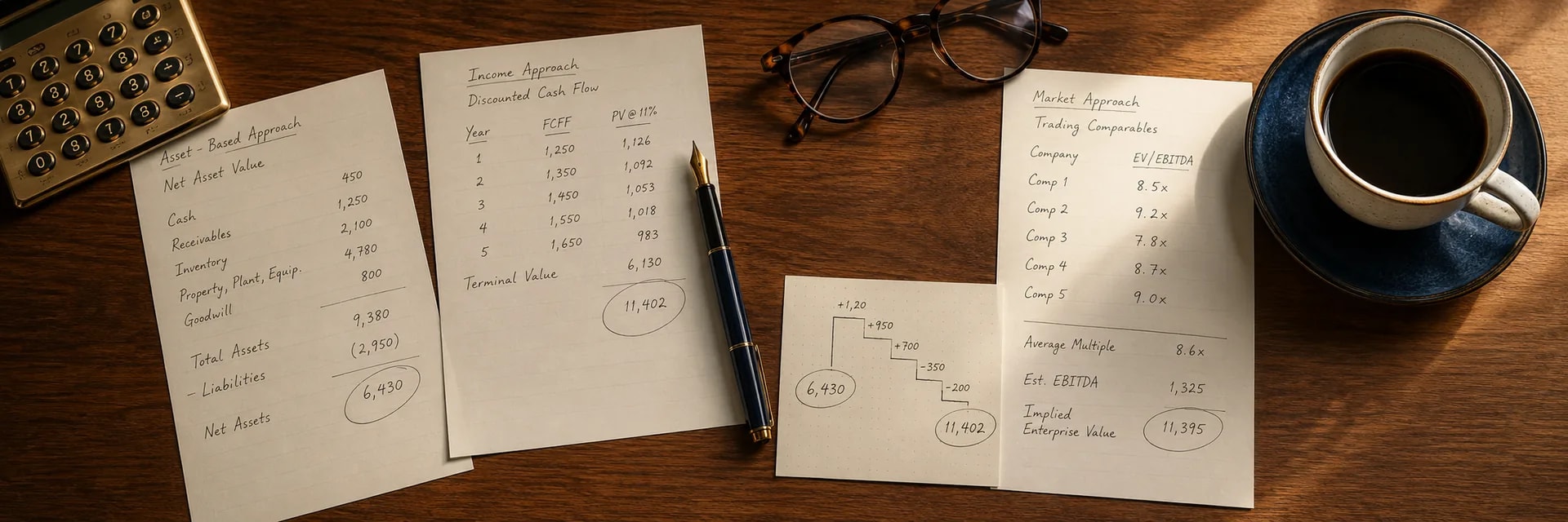
Layer one: Valuation
The first layer tracks core valuation multiples against historical averages to prevent overpaying for assets. As of early 2026, the S&P 500 Price-to-Earnings ratio sits at 29.12, near historical highs. This expensive market environment makes valuation discipline essential. Investors who skip this layer and rely on price momentum alone risk buying quality businesses at prices that guarantee poor long-term returns regardless of underlying business performance.
This layer belongs in the monthly review checkpoint. Stock market dashboards that surface valuation data at monthly intervals prevent investors from treating short-term price swings as meaningful signals. Valuation multiples shift slowly enough that daily monitoring adds no analytical value and increases the risk of reactive decisions based on short-term fluctuations. An equity levels screener identifies candidates that trade below their historical valuation averages before the deeper checklist layers begin.
Layer two: Earnings Quality
The second layer evaluates whether reported earnings reflect genuine business health. Companies frequently manipulate net income through accounting choices, but cash generation reveals the underlying reality. Researchers at Harvard Business School found that cash flows predict future cash flows with 1.6 times greater accuracy than earnings. Free cash flow consistency confirms that a company generates real money to fund dividends and operations rather than engineered accounting results.
This layer belongs in the quarterly review checkpoint, aligned with corporate reporting seasons. During the most recent earnings cycle, 43% of US-listed stocks beat FactSet earnings expectations in Q4 2025. A checklist-driven dashboard updates with this fundamental data systematically rather than reactively.
Layer three: Macroeconomic Context
The third layer contextualizes broader market movements without allowing them to dominate the analysis. Investors monitor the Volatility Index to gauge market fear and identify potential buying opportunities. Severe market stress creates panic periods that reward patient capital.
During the August 2024 sell-off, the VIX spiked to 66 pre-market, which created conditions where strong businesses became available at significant discounts. Investors who reviewed this layer on a scheduled weekly basis recognized the opportunity without the distortion of daily price anxiety.
Keeping macroeconomic indicators in a dedicated layer prevents a common failure. Short-term events like geopolitical oil spikes or monthly jobs data should not override a long-term investment thesis built on years of fundamental research.
Layer four: Competitive Moat
The fourth layer assesses business durability through Return on Invested Capital trends tracked over five to ten years. A consistently high and stable ROIC indicates a genuine competitive advantage. A declining ROIC trend, even when accompanied by rising revenue, signals that the business is losing its ability to generate returns above its cost of capital.
This is the core measure of long-term value creation. A well-maintained stock chart library plots ROIC trends over five to ten years and makes competitive advantage deterioration visible before it appears in earnings reports.
This layer belongs in the quarterly review alongside earnings quality. Together these two layers answer the most important question in fundamental analysis: is this a good business, and is it getting better or worse?
Layer five: Risk and Red Flags
The final layer functions as an early warning system. Rising debt loads, consecutive earnings misses, and significant insider selling patterns often precede major stock declines. Governance deterioration deserves particular attention. Harvard Law School research indicates that institutional investor distraction increases problematic board director appointments by 46.5%. These governance changes signal deteriorating management quality before financial results reflect the damage.
This layer prevents confirmation bias, which is the tendency to seek evidence that confirms an existing position while contradictory signals get ignored. A dedicated risk layer forces investors to confront negative data about their holdings and sell positions when the fundamental thesis permanently breaks rather than when the price temporarily drops. A stock chart library that tracks debt levels and insider activity alongside price history gives this layer the visual evidence it needs to challenge an existing thesis.
Alert thresholds
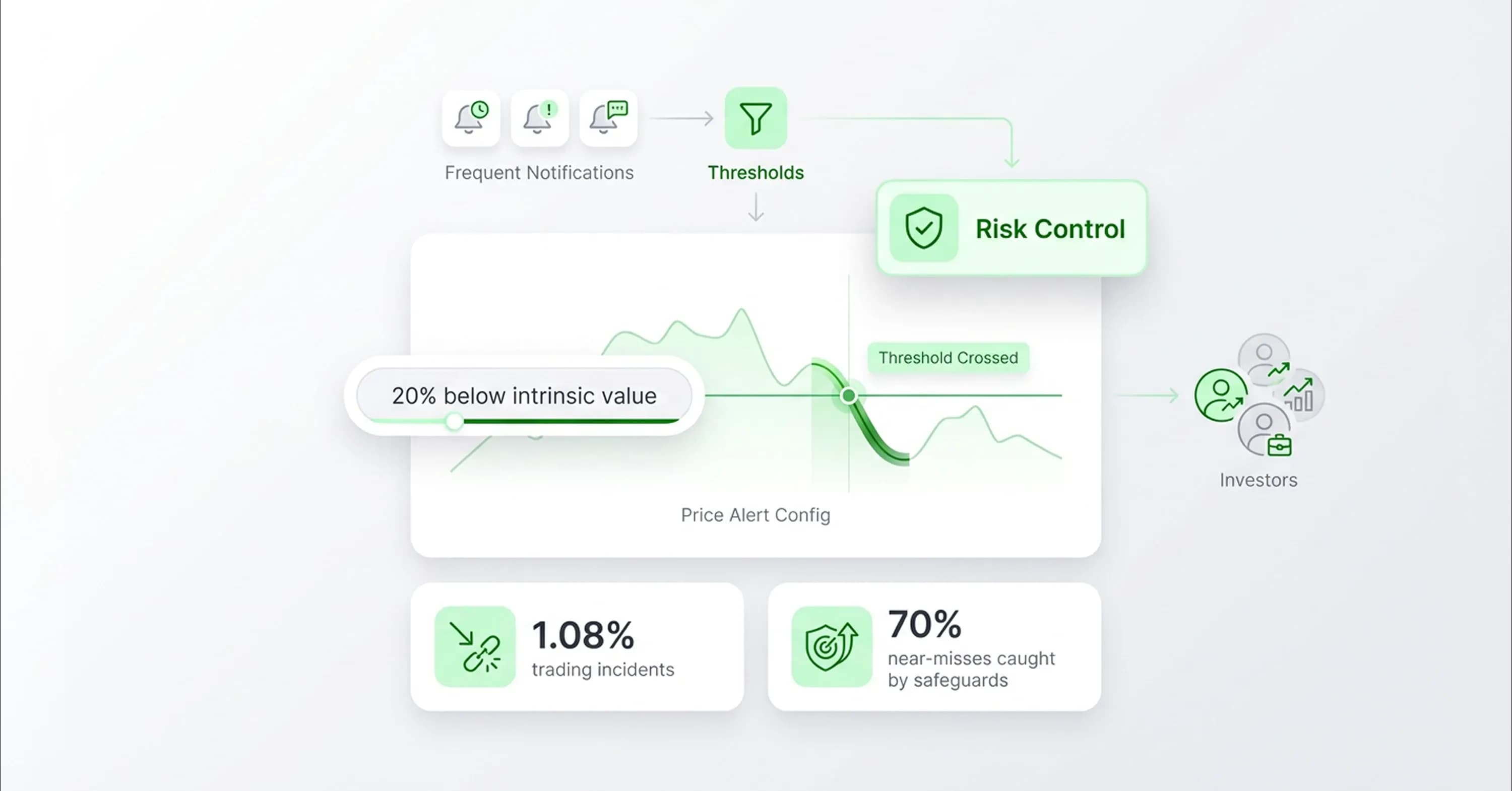
A checklist-driven dashboard requires alert thresholds calibrated to match the review schedule rather than real-time price movements. Constant notifications create fatigue and encourage exactly the reactive behavior the checklist is designed to prevent. Stock market dashboards configured with sparse, threshold-based alerts serve the investor's long-term process rather than disrupting it.
Effective alerts trigger only when a holding crosses a meaningful valuation threshold or shows genuine fundamental deterioration. For example, an alert fires when a target company's price drops twenty percent below its calculated intrinsic value.
Research into financial operations reveals that trading incidents occur in 1.08% of all transactions, and institutional safeguards catch seventy percent of these near-misses. Individual investors lack these protections. Reduced notification frequency serves as the retail investor's equivalent of institutional risk controls. When an alert finally triggers under this system, the investor knows the event warrants genuine attention rather than treating it as one of dozens of daily interruptions.
Benchmark selection
Accurate performance measurement requires a benchmark matched to the investment strategy rather than defaulting to the cap-weighted S&P 500. Mega-cap technology companies heavily influence that index, which makes it an unreliable comparison for diversified fundamental portfolios. A psychological shift toward beating the benchmark changes focus from absolute returns and leads to irrational portfolio decisions.
In early 2026, the equal-weight S&P 500 rose 2.4% while the cap-weighted version increased only 0.6%. This performance difference indicates improving market breadth that standard indices hide. A strategy-matched benchmark should be a fixed checklist component.
An equity levels screener configured with strategy-matched filters reinforces this benchmark discipline by surfacing only the candidates that fit the investment mandate. It prevents investors from abandoning a sound process during temporary periods of relative underperformance.
Periodic review ritual
The checklist only delivers its value when applied on a consistent schedule. Erratic reviews produce the same emotional reactions as real-time monitoring. A fixed review ritual anchors the entire system. Stock market dashboards organized around this three-tier schedule replace emotional monitoring with structured analytical checkpoints:
-
Weekly: Macroeconomic indicators and broader index movements, reviewed when markets are closed to remove price pressure from the analysis.
-
Monthly: Valuation multiples and sector rotation signals to identify new capital allocation opportunities.
-
Quarterly: Earnings reports, free cash flow model updates, and competitive moat verification aligned with corporate reporting seasons.
This schedule ensures every metric receives attention at the appropriate interval. The quarterly review carries the most weight because it aligns directly with the fundamental data that drives long-term returns. Investors use this checkpoint to determine whether the investment thesis remains intact rather than whether the price moved favorably last week.
Conclusion
A well-constructed stock market dashboards checklist functions as a discipline system rather than a trading terminal. The five-layer framework, valuation, earnings quality, macroeconomic context, competitive moat, and risk, creates a structured audit process that filters short-term noise and focuses attention on fundamental business reality. The periodic review ritual enforces the patience that separates long-term capital allocation from reactive trading.
In volatile environments like early 2026, investors who follow this process act with conviction when genuine valuation opportunities emerge rather than reacting to the noise that surrounds them. InvestViable helps investors apply this discipline through a valuation tool that makes fundamental data clear and actionable. 19:T3354,{