Introduction
Financial markets produce an unprecedented volume of data every second, yet this flood of information often reduces investor insight. Most market participants use stock market visualizations merely to track short-term price action and treat charts as betting slips rather than analytical instruments. However, these tools serve a much higher purpose. They act as "translation layers" that convert dense spreadsheets and complex financial ratios into clear patterns of business quality and valuation anomalies.
The core problem lies in the application of these tools. When investors rely on superficial visual patterns and do not understand the underlying data assumptions, they risk capital destruction through misinterpretation. Edward Tufte notes that data-rich designs give context and credibility to statistical evidence, but analysts must earn this credibility through rigorous verification.
This guide shifts the focus from chart-driven trading to evidence-based analysis and explains how to use visualizations to uncover the intrinsic value of a business.
Disclaimer: This article is for educational purposes only and does not constitute investment advice. Stock market visualizations support understanding and hypothesis generation, but they do not produce certainty or guarantee future results.
Translation Layers vs Crystal Balls
Investors perceive data consumption differently when they define their tools correctly. Stock market visualizations act as translation layers that convert dense financial data into interpretable formats like heatmaps and factor views. However, investors often mistake these tools for prediction engines that foresee short-term price movements. Research from MIT suggests that stock price changes follow random walk patterns, so technical analysis fails to forecast results reliably. Investors use these tools to gain clarity on business fundamentals instead of predicting the future.
Edward Tufte advises analysts to maximize the data-ink ratio because the design should show the data above all else. This approach requires discernment. Visuals can highlight anomalies in equity market data infrastructure, but they cannot replace financial statements. Charts summarize the story, but the 10-K report contains the details. Investors understand this distinction and move from gambling on lines to analyzing business quality.
Dashboard Configuration Logic
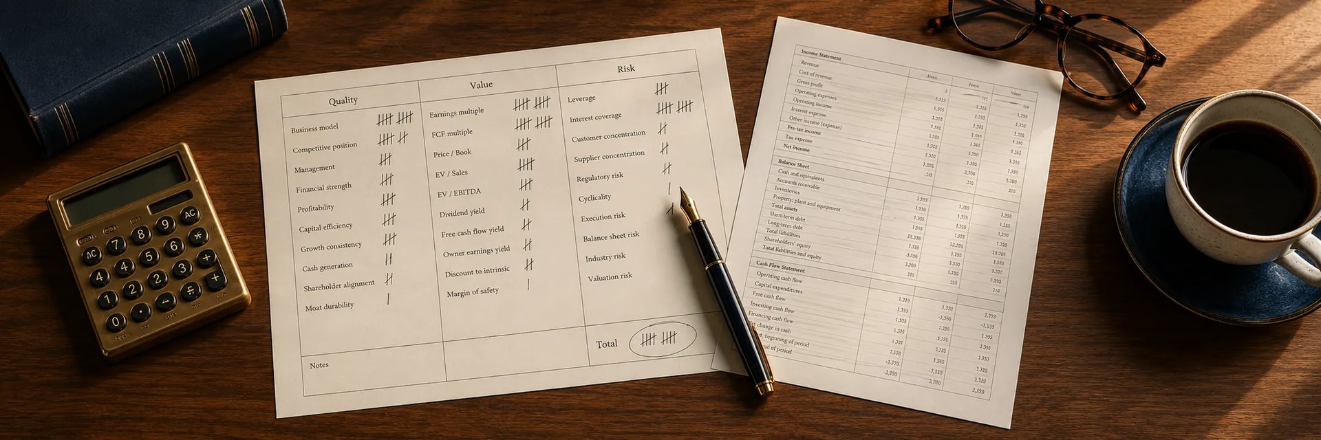
Analysis of business quality requires a well-configured dashboard that prioritizes logic over price action. Investors often default to price charts, but a market visualization platform serves a better purpose when it focuses on valuation metrics.
The Nasdaq Composite plunged 80% from its peak during the dot-com bubble, and this crash demonstrated the danger of ignoring valuation limits. Warren Buffett notes that a long-term view is critical, so investors configure their screens to reflect this prudence. Dashboards strip away noise and highlight the relationship between price and value.
The following steps help setup a value-focused workspace:
-
Reducing distraction requires removing all short-term price tickers and news feeds from the main view.
-
Fundamental ratio charts track Price-to-Earnings and Free Cash Flow yield over ten-year periods.
-
Valuation bands display standard deviation ranges to identify statistical outliers.
-
Alerts function best when based on valuation compression rather than price momentum.
This configuration brings precision to the fundamental analysis workflow and prevents emotional reactions to daily volatility.
Historical Valuation Multiples
This precision allows investors to focus on historical context, which reveals whether a stock trades at a premium or a discount relative to its own past. A stock market visualization helps investors identify mean reversion potential. Valuation multiples like P/E or EV/EBITDA often fluctuate around a long-term average.
When a stock trades two standard deviations above its ten-year mean, the risk of contraction increases. Howard Marks suggests that no one should go all-in or all-out, and visual data supports this balanced approach by showing where the current multiple sits in context. Investors spot when optimism pushes prices beyond historical norms. This visual evidence supports the valuation ranges framework and signals when to investigate further.
Valuation Spreads Visualization Guide
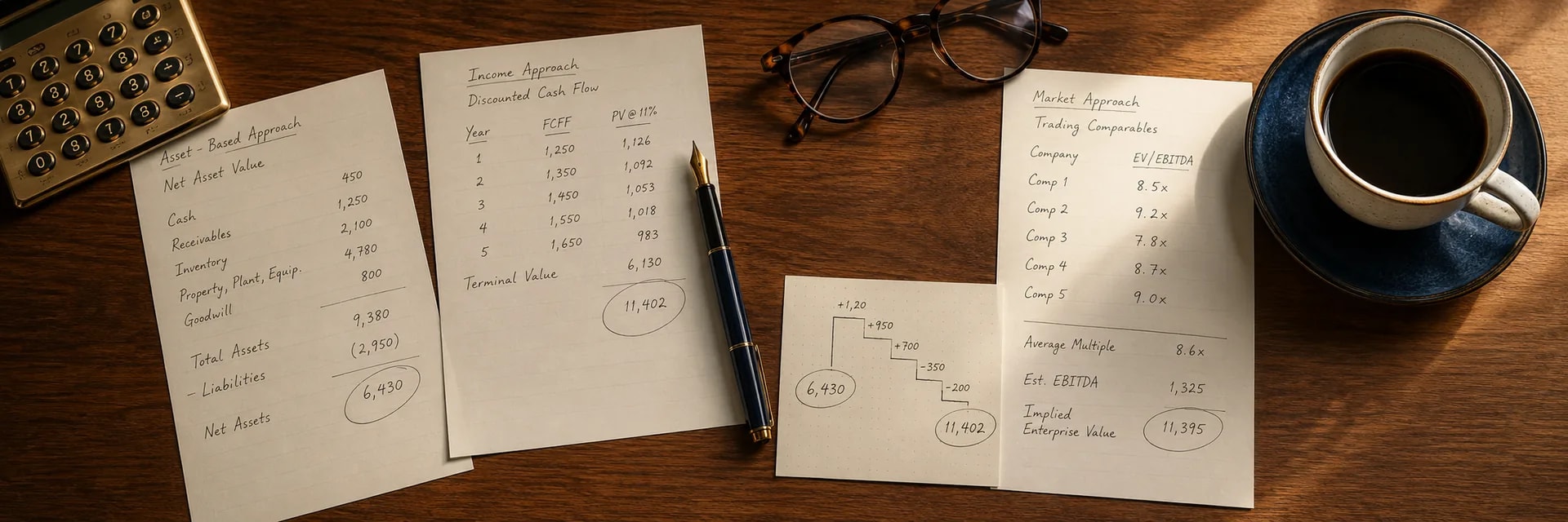
Investors investigate these signals and use visualizations of the spread between price and value to confirm the margin of safety. A market visualization platform graphs the gap between the market price and the estimated intrinsic value. This spread represents the potential return or risk.
Warren Buffett makes no attempt to forecast the general market, and this philosophy supports focusing on specific value gaps rather than broad trends. Investors plot this spread over time to see if the margin of safety expands or contracts. Verification of this gap provides the confidence needed to enter a position. This method transforms abstract valuation models into concrete visual signals.
Business Quality and Risk
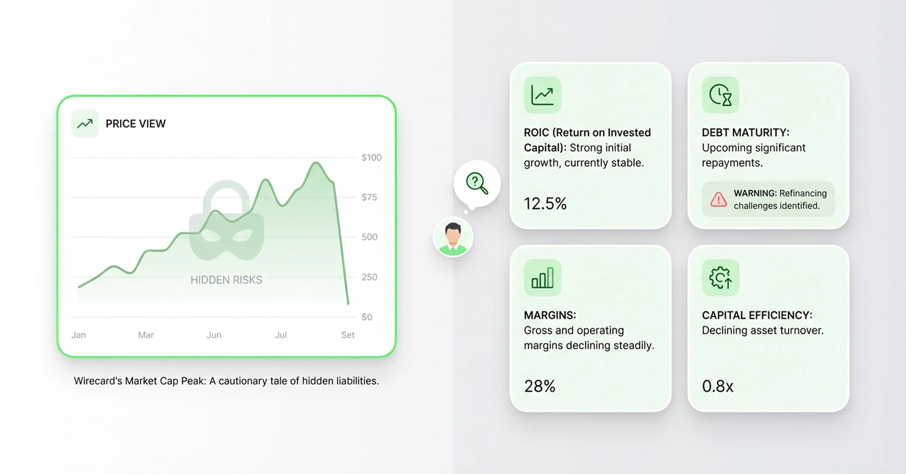
These signals highlight value, but standard price charts often hide the most dangerous risks. Stock market visualizations reveal threats that do not appear in daily price movements. For example, Wirecard stock peaked near the market cap of Deutsche Bank, and the price chart showed strength even while the underlying business crumbled. Investors need skepticism when they view upward trends. Visual tools track debt maturity cliffs and margin degradation over time.
Enron hid debt and reported increasing revenues, but a chart of Return on Invested Capital (ROIC) would have shown a disconnect between capital efficiency and reported growth. When ROIC trends down while the stock price trends up, the integrity of the business model might be compromised. Visualizations of these invisible metrics help investors complete a safety checklist and protect capital from value traps that look promising on the surface.
Platform Audit Framework
Reliable analysis requires a strong market visualization platform that does not just display data but explains the source. Investors often base valuations on inflated numbers because they rely on charts but do not understand the underlying data definitions. The primary issue stems from the difference between GAAP (Generally Accepted Accounting Principles) and non-GAAP earnings. Management teams often adjust earnings to remove "one-time" costs, and this makes the company appear more profitable than it actually is.
Recent studies show that about 90% of S&P 500 firms report non-GAAP metrics outside accounting principles. If a visualization tool defaults to these adjusted numbers without a clear label, the valuation multiples will look artificially low. This discrepancy requires rigorous verification.
The following checklist ensures the visualization tool is transparent and accurate:
-
Metric Definitions: Platforms should display GAAP or non-GAAP earnings by default and allow users to toggle between them.
-
Survivorship Inclusion: Historical data needs to include companies that went bankrupt or were delisted, rather than just current survivors.
-
Data Audit Trail: Platforms link data points directly back to original SEC filings or 10-K reports for manual verification.
-
Timeframe Continuity: Data must cover full economic cycles, including recessions, rather than just recent bull market periods.
Once your platform passes the audit checklist above, the next question is what to build on top of it. For the three-view construction methodology — Quality Check, Valuation Band, and Intrinsic Value Link overlays — see Three graphs every value investor should build.
Audit findings: survivorship bias and Y-axis manipulation
Transparent data does not guarantee clarity because visual appeal often masks analytical danger. Investors frequently fall for the deception of clean historical lines and bright heatmaps because they assume that a clear chart equals a clear investment thesis. However, the design choices behind these graphics can manipulate perception.
Survivorship bias stands out as a primary offender in sector heatmaps and long-term performance charts. When a market visualization platform renders the past performance of a specific sector, it usually displays only the companies that exist today. This removes all the failed businesses from the history, and this makes the sector appear safer and more profitable than it truly was. Research indicates that survivorship bias explains approximately one-third of the historical equity risk premium.
Scale manipulation also distorts reality. A common trick alters the Y-axis of a chart to exclude zero. This technique magnifies insignificant price movements and makes a stable stock look volatile or a flat growth curve look exponential. Truncated axes exaggerate small differences and mislead readers about the actual data.
Conclusion
These checks reveal that the best stock market visualizations are not those with the most complex features, but those with the most transparent data assumptions. Visual tools serve as engines for hypothesis generation, and they help investors spot anomalies in valuation and business quality that spreadsheets might hide. However, they are never validation tools on their own.
Auditing current toolsets for survivorship bias and data sourcing helps investors trust the patterns they see. InvestViable designs analysis tools that prioritize fundamental clarity over visual noise. The company offers valuation tools that verify intrinsic value and ensure capital relies on rigor rather than pretty charts.