Introduction
Stock market participants often struggle to find signal in the noise because standard analysis tools prioritize price momentum over business reality. Most default stock charts come pre-loaded with technical indicators like RSI or MACD, and these tools serve day traders but offer little value for long-term valuation. Minute-by-minute sentiment fails to provide the historical context of a business. Focusing solely on price action hides the divergence between a company's stock price and its economic engine.
This article guides the construction of a visual operating system that replaces trading signals with fundamental overlays. Mapping metrics like operating margins and free cash flow directly against price history creates a powerful defense against emotional decision-making. This approach matters in bifurcated markets, such as the early 2026 environment where the sector performance gap reached over 24%.
Disclaimer: This content serves educational purposes only and does not constitute investment advice. This article discusses visualization for valuation and fundamentals rather than chart-based trading.
Visual Toolkit Definition
Valuation analysis requires a clear distinction between a chart and a graph, even though market participants often use the terms interchangeably. A chart typically tracks a single variable-price-over time. This single-dimensional view suits traders who capitalize on momentum and sentiment. However, a graph compares multiple variables to reveal relationships. For the value investor, plotting revenue growth, operating margins, or book value against price provides methodical insight into business performance.
Benjamin Graham warned that speculators use charts or mechanical means to determine buy and sell moments. Reliance on price action alone obscures the underlying economic reality. A well-constructed stock chart library moves beyond simple price tracking. It requires a multi-dimensional approach that visualizes the gap between market perception and fundamental reality.
This shift brings clarity to the investment process. Investors who understand data infrastructure risks know that incorrect visualization leads to poor decisions. The transition from tracking price to graphing business fundamentals creates the foundation for durable long-term returns.
Graphs For Stock Market Valuation
Standard financial platforms complicate this foundation because they prioritize trading intent over valuation intent. Most default settings display short-term volatility and volume. Valuation intent requires a rigorous focus on the business itself. Benjamin Graham emphasized that stocks represent ownership interests in actual businesses with value, not just ticker symbols. Advanced investors use Fundamental Overlays to honor this principle. This technique superimposes metrics like Free Cash Flow or Return on Invested Capital directly over the price history.
These overlays act as a lie detector for market sentiment. When price lines soar while fundamental lines remain flat, the visualization reveals a speculative bubble. Conversely, price drops accompanied by rising fundamentals signal opportunity. Graphs for stock market valuation make this distinction visible. A precision-focused stock chart library allows investors to spot these divergences instantly. Reliable value calculation formulas transform abstract numbers into visual evidence. This approach forces the market price to justify itself against the company's economic engine.
Library Structure
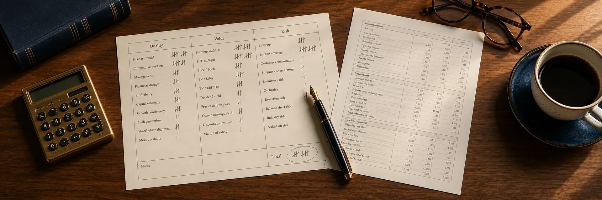
A complete visualization system applies this justification approach through three specific views that filter opportunities. These views function as a checklist for durability and potential return. The first view confirms business quality, the second assesses historical valuation, and the third measures intrinsic value. This systematic framework prevents investors from buying low-quality businesses just because they appear cheap.
System configuration with these distinct perspectives ensures a comprehensive audit of every potential investment. Analysis often becomes disjointed without this structure. An equity levels screener identifies candidates, but the visual library confirms the thesis. Each view answers a critical question about the asset, from the strength of its competitive advantage to the safety margin offered by the current price. This structured approach enforces discipline and reduces the likelihood of unforced errors.
View 1: Quality Check
The first view prevents these errors by visualizing the company's operational history. This graph plots Gross, Operating, and Net margins alongside Return on Invested Capital (ROIC) over a minimum 10-year period. A ten-year visualization of these metrics reveals the stability of the company's competitive advantage. A flat or rising ROIC line demonstrates that management deploys capital efficiently, while volatile margins often signal a lack of pricing power.
Fund manager Terry Smith argues that return on capital matters more than the earnings per share growth metric. An objective assessment of these trends filters out businesses that grow through debt or acquisition rather than operational excellence. Deteriorating economics in the quality view halt the analysis.
View 2: Valuation Band
The second view places the current price within the context of its own history if the quality check passes. Investors often call this visualization a Football Field or valuation channel because it overlays the stock's historical Price-to-Earnings (P/E) or Price-to-Free Cash Flow ranges onto the price chart. This reveals whether a quality asset currently trades at a statistical premium or discount relative to its normal trading range.
Peter Lynch suggested that a fairly priced company's P/E ratio equals its growth rate. These multiples help investors identify mean reversion opportunities. Even high-quality companies become poor investments if bought at peak multiples. This view complements an equity levels screener by verifying if a statistically cheap stock is trading near the bottom of its historical valuation band.
View 3: Intrinsic Value Link
The final view overlays calculated intrinsic value ranges directly onto the price action to confirm the signal from the valuation band. This graph displays Discounted Cash Flow (DCF) sensitivity bands or "Fair Value" lines to visualize the gap between market price and theoretical value. This gap represents the Margin of Safety.
Benjamin Graham emphasized the necessity of buying stocks substantially below intrinsic value to ensure safety. When the price line dips below the conservative fair value band, the chart signals a buying opportunity based on fundamentals rather than technical support levels. This disciplined visualization protects investors from overpaying for growth. It serves as the final confirmation that the market offers a mathematically favorable entry point into a high-quality business.
Valuation Zones Screening
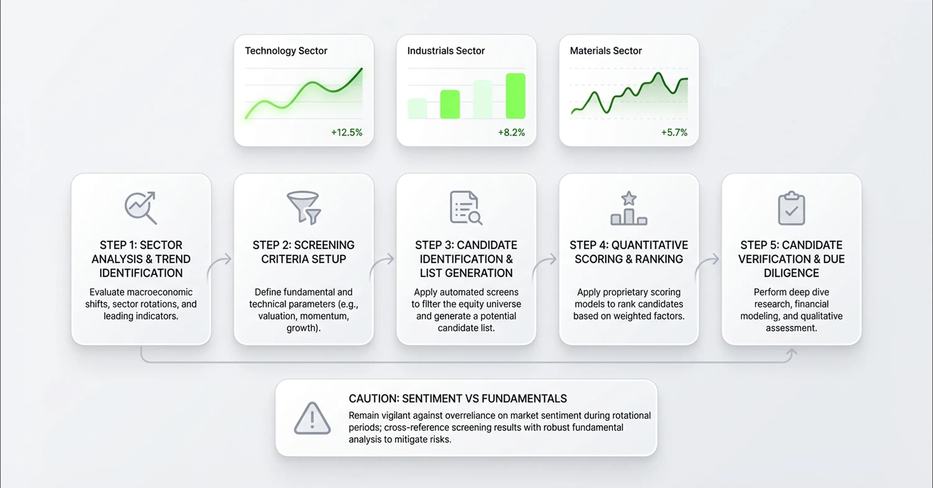
Evaluations of intrinsic value become critical when sector rotation, such as the shift in early 2026, demonstrates that price action misleads investors. The Technology sector dropped 1.97% over three months after a massive 21.43% gain the prior year. In contrast, the Industrials and Materials sectors surged 21.92% and 25.68% respectively.
Investors who look solely at price momentum might chase the industrial rally and mistake a cyclical upswing for secular growth. Morningstar strategist Dave Sekera noted that the market is probably over-extrapolating industrial earnings because of enthusiasm about AI infrastructure. This environment requires a methodical approach to filter noise and identify true value.
An equity levels screener allows investors to find value within these rotations systematically. This tool avoids chasing heat and isolates companies that trade at the lower end of their historical valuation bands. The workflow proceeds as follows:
-
Define Quality Universe: The process filters for companies with stable margins and high ROIC to ensure that any price decline stems from sentiment shifts rather than fundamental business deterioration.
-
Apply Historical Valuation Bands: The screener identifies stocks where the current P/E or P/FCF ratio sits in the bottom quartile of its five-year range. This highlights potential mean reversion candidates.
-
Verify with Graphs: Investors move valid candidates into their graphs for stock market analysis. They confirm visually that the valuation compression implies a temporary opportunity rather than a permanent structural impairment.
Combining broad screening with deep visual verification helps investors avoid the trap of buying low-quality companies that appear statistically cheap.
Construction pitfalls: linear scale, corporate actions, timeframe bias
However, visual analysis requires skepticism because aesthetic charts often mask underlying risks. This phenomenon is known as the Narrative Fallacy. This recently played out in the software sector where companies originated at high valuation multiples based on past growth narratives.
However, fears about AI disruption caused a rapid repricing. Major players like Workday fell nearly 25% since February 3 after the selloff. An unadjusted price chart might interpret this drop as a simple "dip," but a valuation graph would have shown the multiple compression well before the price collapsed.
These are pitfalls in how you construct the graph. The separate category — data-integrity issues with the platform serving the underlying data (survivorship bias, GAAP vs non-GAAP defaults, audit-trail gaps) — is covered in How to audit your stock market visualization platform for data integrity.
A rigorous stock chart library demands accuracy in how data is presented. Common visual pitfalls include:
-
Linear Scale Distortion: Linear scales for long-term charts exaggerate recent volatility and compress historical moves, whereas logarithmic scales accurately represent percentage growth over time.
-
Corporate Action Omissions: Charts that fail to adjust for stock splits or dividends create false gaps in price history and distort the calculation of total return.
-
Timeframe Bias: A narrow focus on short-term price action hides the long-term compounding effects of high-quality businesses.
Investors must ensure their tools account for these variables. A proper probabilistic analysis framework relies on clean data visualization to assess the range of possible outcomes. When graphs for stock market analysis are free from these distortions, they become reliable instruments for decision-making.
Conclusion
Price action frequently deceives investors in a bifurcated market, but fundamental trends reveal the truth. Custom visualization methods change a screen from a source of noise into a defense mechanism against emotional errors. Effective long-term investing requires the visualization of the business instead of the ticker.
Visualization tools require an audit. Charts that display price but fail to overlay earnings, margins, or fair value zones remain incomplete. Investors who anchor decisions in fundamentals and stock market valuations rather than momentum navigate sector rotations better and find intrinsic value discrepancies. InvestViable addresses this need with specialized valuation software, and investors can try the tools to visualize fair value zones.