
Assess a moat in three passes. First name the source: network effects, switching costs, intangibles such as brand and patents, a cost advantage, or efficient scale. Each source produces a different checkable trace, so identify one before looking at the numbers. Second, find the evidence that source should leave. That means pricing held against rising input costs, contract length or retention, capacity utilization, and the return earned on capital committed to the business. Third, test durability by naming what must remain true, over what horizon, and which reported figure would fall first if it stopped being true. A return above the cost of capital confirms an advantage existed. It says nothing about how long the advantage lasts.
What an economic moat assessment actually claims
Two statements often get treated as one. The first is that a company earned an unusually good return last year. The second is that it will keep doing so while competitors try to take the business away. Only the first is a fact. The second is a forecast, and an economic moat assessment is the discipline of making that forecast explicit enough to check.
The distinction matters because a positive spread is not by itself unusual. Take Aswath Damodaran's economic value added dataset, with data as of January 2026. The US market excluding financials earned a return on capital of 15.07 percent against a cost of capital of 7.72 percent. That is a spread of 7.35 points across 4,822 firms. Read that as the condition of the market in aggregate. Whether it is the condition of the typical firm is a different question, and this capital-weighted table does not answer it.
Name the convention behind both figures before leaning on the gap. The return is trailing operating profit after tax over book invested capital, meaning book debt plus book equity less cash. The cost of capital is a weighted average of the cost of equity and the after-tax cost of debt, weighted at market values. So the spread pairs a book-based return with a market-based hurdle, which is standard practice and still a mismatch worth naming.
Two accounting effects then push the return itself around. Research and advertising spending is expensed rather than capitalized, which keeps it out of the capital base while also holding down reported profit. For a business whose spend is growing, the denominator effect usually dominates and the ratio rises. Acquired goodwill runs the other way, entering the capital base of businesses built by acquisition and lowering the ratio. The measure is useful and it is not neutral.
So the moat question is not whether a spread exists. It is how long the spread survives, and what mechanism holds it open. That mechanism is the moat. The metaphor is Warren Buffett's, and its value is that it points at a structure rather than at a result.
The safety checklist for avoiding value traps uses gross margin erosion as its moat proxy at Step 5, which is the right first cut in a screening pass. Margin erosion is a symptom that appears once an advantage is already going. This article works the other direction, starting from the mechanism and asking what it should leave behind while it still holds.
The five sources of a competitive advantage
An advantage has to come from somewhere, and the number of somewheres is small. Naming the source is the step most assessments skip, and it is the step that determines every piece of evidence you should then go looking for.
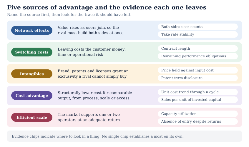
Network effects make a service more valuable as more people use it. The mechanism is that the incumbent's users are themselves the product a competitor cannot copy. A rival must assemble both sides of the market at once, which is why the barrier is coordination rather than capital.
Switching costs impose money, time or risk on the customer who leaves. The cost may be retraining, data migration, integration work, or the operational risk of changing a system that currently works. The customer stays because moving is expensive, not because the product is better.
Intangibles cover brand, patents and regulatory licenses. Each grants a legal or psychological exclusivity a competitor cannot buy on the open market. Brand supports a price premium; a patent excludes copying for a fixed term; a license limits who may operate at all.
A cost advantage means producing comparable output for structurally less. The source may be a process, a scale threshold, a location, or privileged access to an input. The test is whether a well-funded entrant could match the cost, and how long matching would take.
Efficient scale describes a market only large enough to support one or two operators earning an adequate return. Entry is unattractive not because entry is blocked, but because a second entrant would make the market unprofitable for both.
What evidence each source leaves in the filings
Once you have named a source, the filing tells you where to look. The SEC bulletin on reading a 10-K sets out the fixed order of items. Item 1, Business, covers products, markets, competition and the regulations that apply. Item 1A, Risk Factors, lists the risks companies generally rank by importance. The notes carry the segment detail and the revenue disclosures.
For network effects, look for counts on both sides of the market and whether growth on one side still pulls the other. The take rate, meaning platform revenue as a share of the transaction value it carries, is the second number to watch. Rising users against a falling take rate can mean the platform is buying participation rather than earning it. A mix shift toward lower-take categories produces the same line, so check the composition first.
For switching costs, the revenue note does most of the work. Remaining performance obligations are the transaction price allocated to promises the company has not yet delivered. Deferred revenue is the billed portion of that balance. Both indicate committed future revenue, with a caveat. Filers may exclude contracts of a year or less, and certain cancellable and variable amounts, so the disclosed figure understates the book. Retention disclosures, where a company gives them, show whether customers renew. Item 1 usually describes the integration that makes leaving awkward.
For intangibles, separate price from mix. Gross margin is revenue less cost of revenue, divided by revenue, and what sits inside cost of revenue is a filer choice. Depreciation, delivery and stock compensation are treated differently, so read the accounting policy note before comparing two filers. A rising margin can come from charging more, from input costs falling, or from mix. Only the first is pricing power, and the management discussion usually separates the three. For patents, Item 1 and Item 1A carry the expiry exposure.
For a cost advantage, the trace is a unit cost that stays below the field through a full cycle, not a single strong year. Sales divided by invested capital shows how much revenue the committed capital carries. Invested capital is not the asset base: it excludes cash and the liabilities that carry no interest. The ratio therefore moves with working capital policy as well as with efficiency. For efficient scale, look for capacity utilization and for the absence of entry despite visible returns.
When the summary you are reading does not tie back to a filing, go to the source. EDGAR filing search will find the exact wording, and how to read a 10-K like a value investor covers the reading order. A moat claim that cannot be traced to a disclosure is a claim about a company nobody has checked.
The durability test: what would have to stay true
Evidence establishes that an advantage exists now. Durability is a separate question, and it needs its own test. Four questions do most of the work, and they are worth answering in order.
What would a competitor have to do to take the customer, and what would that cost them? Put a number or a timeline on it. If the answer is that a funded rival could match the offer in a year, you have a product lead rather than a durable competitive advantage.
Does the advantage rest on something that expires or on something that compounds? A patent term, a license renewal and a long contract all have end dates, and an end date is a date you can put in a model. Network effects and accumulated switching costs work the other way, strengthening as the installed base grows.
Must the company keep spending to hold the position? Brands and platforms usually require continuing investment in marketing, product or subsidy. If that spending is already inside the reported margin, the margin is defensible. If the position depends on spending the company has not yet made, the current margin overstates it.
Which reported figure moves first if the advantage erodes? Choose one, and choose one that gets reported. Pricing net of input costs, retention, take rate and share of a disclosed segment are all candidates. Guessing about a metric the company never publishes gives you nothing to monitor.
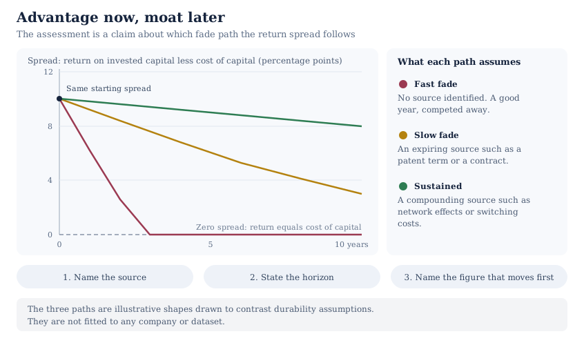
Then write the claim as one sentence: the source, the horizon, and the figure you will watch. A sentence someone else can disagree with is worth more than a paragraph nobody can test.
Where the return spread fits, and where it misleads
The spread between return on invested capital and the cost of capital is the standard corroboration for a moat claim, and it deserves that place. It is also read past its evidence more often than any other figure in the exercise. Use it to confirm a source you have already named, not to discover one.
Damodaran's January 2026 industry table shows how wide the range runs. Tobacco, with 10 firms, earned a return on capital of 63.08 percent against a 6.94 percent cost of capital. The same row carries negative book equity for that group, which shrinks the capital denominator and lifts the ratio, exactly the distortion described above. Auto and truck manufacturers, with 33 firms, earned 2.25 percent against 9.38 percent, a negative spread of 7.13 points. Systems and application software, with 309 firms, earned 29.32 percent against 9.34 percent. These are his own industry groupings rather than a standard sector classification, so read them as groupings of comparable businesses and not as index sectors.
A wide spread also has to be reinvestable to matter. Damodaran's capital expenditure dataset is a separate file built on its own aggregates. It puts net capital expenditure at 17.82 percent of sales for systems and application software, and at negative 0.91 percent for tobacco. Damodaran defines net capital expenditure as capital spending less depreciation. The same table carries separate columns for acquisitions and net research spending, so check which of them the ratio folds in before reading it as plant alone. On either reading, the first group is growing its operating asset base and the second is letting its own shrink. Neither figure says what the return on that incremental capital was, and neither says where the unspent cash went. Both patterns can be sound, and they compound differently. A moat assessment that ignores reinvestment describes only half of the value.
Two accounting effects distort the comparison, and both run in predictable directions. Expensed research and advertising keep intangible-heavy businesses out of their own capital base, which flatters the ratio. Acquired goodwill enters the capital base of businesses built by acquisition, which depresses it. Return on invested capital against return on equity and return on assets sets out the goodwill-inclusive and goodwill-excluded bases and why mixing them produces nonsense.
Read the spread as a symptom with several possible causes. The assessment is the work of establishing which cause applies.
Common false positives in moat assessment
Five patterns produce a confident moat claim that the evidence does not support. Each has a specific correction.
A cyclical peak is the easiest one to make. Commodity producers, shipping operators and homebuilders all post wide spreads at the top of a price cycle, and the spread reflects the cycle rather than a structure. Normalizing earnings before valuing a cyclical stock sets out how to strip the cycle out before drawing any conclusion about quality.
Accounting artifacts come second, and the two directions were described above. An asset-light business with expensed intangibles will look structurally better than a capital-intensive one with the same economics.
Customer concentration gets mistaken for switching costs. One customer at forty percent of revenue is a dependency, and the direction of the leverage usually runs toward the buyer. Check whether the customer would find it hard to leave, or whether the supplier would find it hard to be replaced. Those are opposite situations that produce the same disclosure.
A margin move driven by mix gets read as pricing power. Divesting a low-margin segment lifts the consolidated gross margin without any change in what customers pay. The segment note usually settles the question, and the same discipline runs through earnings quality red flags.
Finally, a regulatory position gets treated as permanent. A license that limits entry is a real advantage while it lasts, and the body that granted it can change the terms. Treat a regulatory moat as having a renewal date even when no date is published.
How to record a moat assessment
Write the assessment down in four lines: the source, the evidence you found, the horizon you are willing to defend, and the reported figure you will watch. Store it next to the valuation rather than in a separate note. What to record in a valuation tracker covers the surrounding fields, and the point of the format is that a future you can audit a past judgment.
The assessment then does one job inside the model. It sets how long you let excess returns run before they fade toward the cost of capital. That choice shows up in the cash flow path you project and in the terminal growth rate you accept. The InvestViable Valuator keeps the discounted cash flow's inputs on the surface: the cash flow growth path, the discount rate, and the terminal growth rate. A moat judgment that changes none of those inputs has not been used.
Nothing automated will do this step for you, and the platform says so. The Investment Score runs 28 checks across valuation, financial strength and performance. The published methodology states that it does not measure the competitive moat. Durability is a judgment about the future rather than a fact in the filings. The score narrows the field. The moat work starts after it.
A practical sequence runs in four steps. Screen for businesses that clear the structural tests using the InvestViable stock screener or the quality slice of our Stock Universe. Read Item 1 and Item 1A on the survivors. Name the source, then run the durability test on the two or three names that still stand. The five-step valuation workflow shows where this sits in the wider process.
InvestViable does not publish buy or sell recommendations on individual securities. All analysis is based on public financial data and a transparent methodology. The Investment Score formula is proprietary; the inputs and what the score evaluates are documented. The industry return and reinvestment figures cited above are Aswath Damodaran's published aggregates for US industry groupings, with data as of January 2026. They describe groups of companies rather than any individual company. The fade paths in Figure 2 are illustrative shapes and are not fitted to any company or dataset.